The collectSPACE Insignia
Celebrating the ten year anniversary of the collectSPACE insignia
Exploring the intersection of spaceflight history, pop culture, and space art.
This issue of Creating Space celebrates the tenth anniversary of the creation of the collectSPACE insignia. I take a look back at how it came to be, and share the creative process that led to the design. And, I highlight some extreme adventures the logo has been on in its first ten years of existence. In art news, I take you along with me to preview the Art+Flight exhibition at Seattle’s Museum of Flight.
Are you new to Creating Space? It’s the NERDSletter that explores the intersection of spaceflight history, pop culture, and space art. You can find this and all other posts at creating-space.art.
Space Art of the Month
collectSPACE Insignia
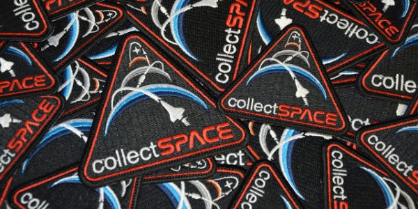
This month marks ten years since I created the artwork for the collectSPACE insignia. The design has been used since 2013 as the logo on collectspace.com and its companion Facebook and Twitter pages.
collectSPACE, which celebrates its twenty-fifth anniversary next year, is a “news publication and online community for space history enthusiasts and professionals. The site's readership includes curators and conservators, educators, authors and space memorabilia collectors.”, according to the website’s About page. Robert Pearlman, a journalist and space historian, created the site in 1999 on the thirtieth anniversary of the first manned lunar landing.
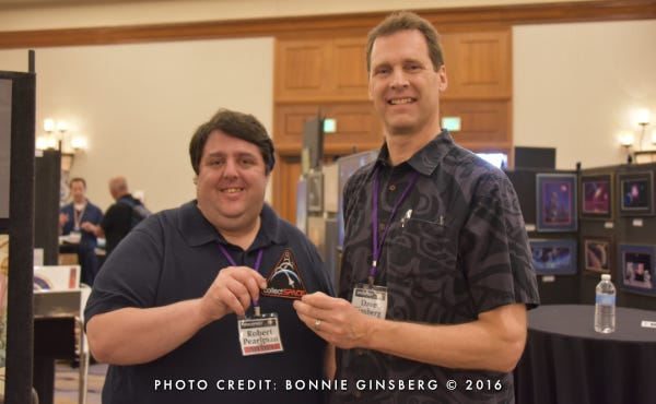
The logo was a result of a suggestion by a collectSPACE member on the community’s message board. The member asked a simple question, “Do you think an embroidered collectSPACE patch would be a good idea?” There was immediate enthusiasm expressed by a number of the members. Robert, who had long desired a patch for the community, eagerly took on the task of collecting design proposals from members of the forum.
At the time, a decade ago, the collectSPACE website used as its header a stylized wordmark combining “collect” in white Helvetica typeface and “SPACE” in a red all caps bold Nasalization typeface. These words stood out against a black background. I felt that a patch should be consistent with this current branding.
At the bottom of every message thread in the forum are buttons for posting new topics or replies. They use the same white and red with black background color scheme as the main wordmark.
Several people in the discussion thread had already submitted designs by email, per Robert’s request. I asked him if anyone had suggested or submitted the idea of a simple patch using the collectSPACE web title art surrounded by a rounded red border in the style of the "post reply" button. As it turned out, no one yet had. So, I made one to add to the others under consideration.
Robert continued collecting design ideas by email for another two weeks, then shared with the group the ten submissions he had received. He reserved the artists’ names so as not to influence anyone’s opinion. Then, as is the hallmark of the collectSPACE community, people began openly expressing their opinions, identifying their favorites, and suggesting modifications.
With the candidate patch designs now revealed, comments began to focus on the symbolism of the elements in each design and on how meaningful they were to the spirit of collectSPACE.
More than one commenter thought it was important to include the Earth, Moon, and Mars, perhaps since they had been the most common destinations for space exploration missions and were associated with their related collectibles. After seeing these suggestions, it dawned on me that the emblems that Michael Okuda had created for NASA’s Constellation program could provide some inspiration.
For those who may not know, Michael Okuda is a graphic designer who may be best known for designing the computer screen displays for the Star Trek television and film franchises. He has also designed logos for several NASA missions and projects.
The insignia Michael designed for the Constellation program, which was the predecessor to the current Artemis lunar program, was a solid blue triangle with three white crescents representing the Earth, Moon, and Mars (the program’s long-term target destination for crewed missions). Michael had also designed an emblem for NASA’s Exploration Systems Mission Directorate. The ‘Exploration’ emblem also included the Earth, Moon, and Mars – this time in color. The illuminated edges of the planetary bodies were illustrated as successively darkening arcs in the color scheme of each body.

In the art world, there is a saying often attributed to Pablo Picasso – “good artists borrow, great artists steal.” It is a self-deprecating motto among artists that refers to the value of previous works as references for creating new artwork. It is indeed a common practice, when learning to create art, to reference the works of a variety of artists and learn from their techniques, their way of composing elements, their use of color, etc.
It was in this spirit that I referenced (borrowed?) elements from Michael Okuda’s emblems for NASA’s Constellation program and Exploration Mission Directorate.
Creative people may understand that there are times when you just have to get an idea out of your head and onto paper, or in this case, the screen as soon as you can. It is not so much a fear of losing the idea, but for me, I can’t seem to concentrate on anything else or even sleep until I act on the creative urge that wants to burst out and be realized. I stayed up late that night composing a new patch design to be considered along with the others that had been submitted, thus far.
I describe myself, in part, as being an analytical left-brained artist. I like to line things up in ways that are pleasing to me, and hopefully not too obvious to the viewer. My feeling is that this attention to detail registers in the subconscious at some level, and makes the composition “work”. With this in mind, I sized and positioned the planets to progressively recede into the background near the top of the triangle. Guidelines were drawn tangent to all three planets’ limbs. The orbital ellipses were centered on each planet. And, in one of those happy accidents that artists love to be surprised with, it turned out that with a little tweaking, I could align each orbital ellipse so that it would cross the next one exactly at its respective planet’s horizon. Such ‘geomagical’ alignments are extremely pleasing when they happen, and they tell me – more often than not – that I am on the right track with a design.
The final touch would be adding specific spacecraft to each orbital path. But, which ones would best represent a community that spanned the globe and whose interests stretched across decades of space exploration? For now, since it was well into the early morning hours, the choice would have to wait. I wanted to send the design to Robert in the morning. So, I hastily used triangles to stand in for the spacecraft.
Here is the resulting first draft.
The design was met with a positive response on the forum the next day when Robert shared it with the group. For me, the most gratifying reaction came from Robert, himself, who shared his pleasure with the design by email. Indeed, the design “worked”!
Ideas came flooding into the message board about what spacecraft should replace the stand-in triangles. In the end, Robert’s own suggestion seemed perfect to me. He suggested that the Earth circling spacecraft be a Space Shuttle orbiter, the Moon orbiting one be an Apollo spacecraft, and the Mars-bound one could stay as it is. He went on to explain that, in his words, “collectSPACE was ‘born’ on the 30th anniversary of the Apollo 11 moon landing and it is a ‘child’ of the space shuttle program.”
I added the Shuttle and Apollo spacecraft, and the design was essentially complete. This one was, by all indications from the comments, the clear choice among the people participating in the discussion. Robert was so impressed with my design that he decided to adopt it not just as a patch, but as a new identifier for collectSPACE. The design has been used as the logo ever since.
Boldly Going Where Astronauts, Aquanauts, and Actors Have Gone
Since the time of their creation, the collectSPACE patch and logo have gone onward to great heights, down to extreme depths, and into the space collections of an astronaut and a film star.
Embroidered collectSPACE patches were gifted to Sandra Bullock, one of the stars of Gravity (2013), and its director, Alfonso Cuarón. Robert Pearlman included the patch along with real space artifacts during his interviews with them.

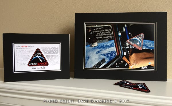
A patch was flown in space with astronaut Scott Kelly during his year-long mission on the International Space Station, from March 2015 to March 2016. While in orbit, Scott took this photo of the patch floating in the space station's Cupola, set against the Earth's horizon.
When I look at this image, I get chills seeing the brilliant blue and white curvature of the Earth framed behind the floating patch with its crescent Earth shimmering in the bright light.

When Scott made an appearance in Seattle the year following his return to Earth from his year-long mission, I took the opportunity to show my thanks for getting one of the collectSPACE patches I designed into orbit. My gift to Scott included a custom matted version of the orbital photo signed and inscribed by me, plus a matted description of the patch design. The inscription on the photo reads, "Scott, Thanks for taking my artwork to new heights!"
Richard Garriott brought a Styrofoam cup decorated with the collectSPACE logo with him on his 2021 deep sea submersible excursion to Challenger Deep in the Mariana Trench in the Western Pacific Ocean. He had hand-drawn a reasonable facsimile of the logo on the cup, which was placed outside the submersible and exposed to the crushing pressure of their 6.8 miles (10.9 km) dive. The extreme pressure shrunk the cup down to a thimble-sized souvenir.

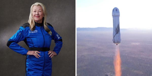
Laura Shepard Churchley, daughter of astronaut Alan Shepard, carried two collectSPACE patches with her on her suborbital flight on Blue Origin’s New Shepard NS-19 in December 2021.
I am still very proud of the design I created for collectSPACE ten years ago, and I am especially grateful that Robert chose the design to represent his website’s identity. I would say it is the most widely viewed of all my space-inspired works, and certainly the most traveled. I look forward to seeing where else the collectSPACE patch may venture in the future.
Art News
The Museum of Flight in Seattle, Washington, opened their Art+Flight exhibition to the public on June 10th.
I am proud to be able to say that my space-inspired digital rendering, Moonlight Dreams, is one of over thirty-one works of flight-inspired art on display.
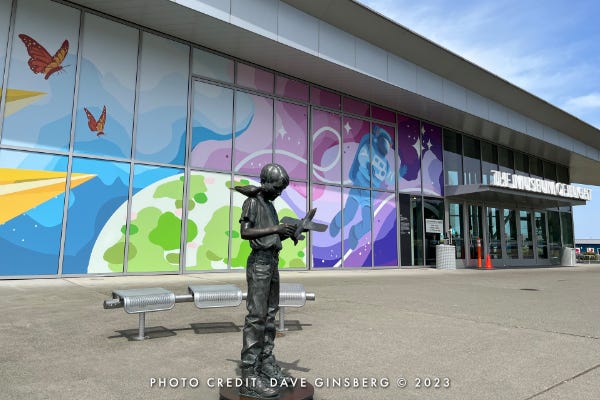
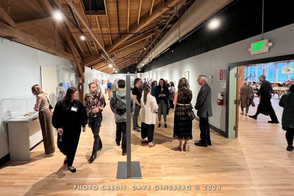
On the night before the exhibition’s public opening, my wife and I attended a special preview event with invited guests and other participating artists. Upon arriving, we immediately saw that the museum had gone all in and transformed itself into a giant work of art. A colorful mural spanned the two-story high array of windows, greeting us as we approached the front of the museum.
I recognized the mural artist arriving at the same time us, from the museum’s exhibit micro site, so I introduced myself as a fellow artist and participant in the show. It was wonderful to see how thrilled she was to have her art presented so prominently.
The main part of the exhibit is located in the historic Boeing ‘Red Barn’ building. I was struck with the visual contract between the rustic wood beam construction of the Red Barn and the smooth gray walls inside the special exhibit space used to display the artwork. It was almost as if the exhibit planners had plucked a gallery out of a wing of an art museum and inserted it into the old Boeing building.
Other works are placed around the Great Gallery, the Personal Courage wing, and the skybridge leading to the Charles Simonyi Space Gallery. One room is devoted to an artist-in-residence who was constructing representations of airplane parts out of woven natural materials such as bamboo and strips of wood.
My Moonlight Dreams piece shares a wall at one end of the long gallery, nearest the double-doored entrance, with a beautiful work made of feathers.
Art+Flight runs from June 10, 2023 through January 7, 2024. The Museum of Flight is located at 9404 East Marginal Way South, Seattle, WA 98108.
Achievement Unlocked: Museum Store
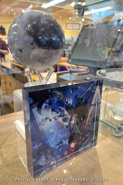
As a first for me, and a special thrill, my artwork is now being offered for sale in the Museum of Flight store.
Stop by if you are in the Seattle area and check out the clear brilliant colors of my prints first hand. Prints are available for purchase in the museum store, and you can always find Moonlight Dreams and more of my artwork for sale at my online shop.
I’m Dave Ginsberg, the artist behind Pixel Planet Pictures and writer of Creating Space.
I am an artist and a creative engineer with a love for teaching and passions for spaceflight, astronomy, and science. My space-inspired art portfolio can be found at pixel-planet-pictures.com.
Do you know fellow Space Geeks who might enjoy Creating Space? Invite them into this space, too!
Did you miss a post? Catch up here.
If you enjoyed this article please hit the ‘Like’ button and feel free to comment.


